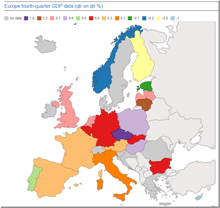
From: http://www.theguardian.com/business/interactive/2014/feb/14/eurozone-economic-growth-gdp-map.
I am a full-time consultant and provide services related to the design, implementation and deployment of mathematical programming, optimization and data-science applications. I also teach courses and workshops. Usually I cannot blog about projects I am doing, but there are many technical notes I'd like to share. Not in the least so I have an easy way to search and find them again myself. You can reach me at erwin@amsterdamoptimization.com.

No comments:
Post a Comment